Picking a ready-made pointer from the catalog is fun, but making your own custom cursor is where Sweezy gets personal. This guide covers both creative tools in the Sweezy Cursors extension, the Constructor and image uploads, and the design rules that keep a homemade pointer sharp, readable and easy to aim on every kind of page.
Two Ways to Create Your Own Custom Cursor
Sweezy gives you two separate routes to a pointer nobody else has. They solve different problems, so it helps to know which one fits what you have in mind before you start.
The Constructor: build an arrow from parts
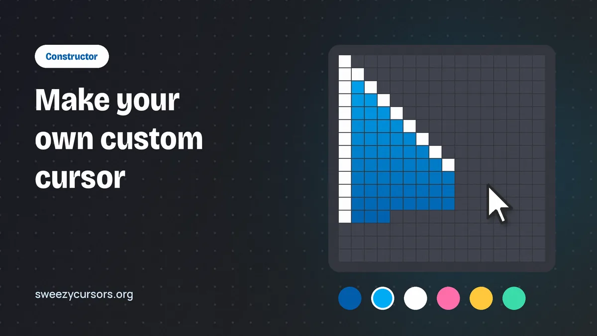
The Constructor is a builder for custom arrow styles. Instead of drawing anything yourself, you assemble a pointer from options the tool provides, adjusting the look until it feels right, and then save the result to use in Chrome. It is the quickest path if you want a clean arrow in your own colors without opening an image editor. Because you start from a proper arrow shape, the tip and proportions are already sensible, which removes most of the mistakes people make when designing from scratch.
The exact controls inside the Constructor can change between versions of the extension, so rather than memorizing a specific panel, think in terms of what you are deciding: the shape of the arrow, its fill color, its outline, and how large it appears. Work through those choices one at a time and preview as you go.
Uploading your own cursor image
The second route is uploading a picture. If you have a character, a logo, a pixel-art sprite or a hand-drawn doodle you want to point with, you prepare it as an image file and add it through the extension. This is the more flexible option because anything you can draw can become a pointer, but it also puts the design responsibility on you. A beautiful illustration can make a terrible cursor if the tip is unclear or the edges vanish against a white page.
So which route should you choose? Use the Constructor when you want a reliable, everyday arrow that matches a color scheme or mood. Use an upload when the design itself is the point: a mascot, a game item, an inside joke. Many people end up with both, a calm Constructor arrow for work hours and an uploaded character for evenings. Since every design in Sweezy is free, there is no cost to experimenting with as many versions as you like. If you have not set the extension up yet, start with the installation guide and come back here.
Design Principles for a Readable Pointer
A cursor is a tool before it is decoration. You aim it hundreds of times an hour at links, checkboxes and tiny close buttons. The rules below are what separate a pointer you enjoy for months from one you switch off after a day.
Put the hotspot at the tip
The hotspot is the single pixel that actually registers a click. On a standard arrow it sits at the very top-left point. When you build a custom cursor, the visual tip of your design should line up with that click point. If your image has a pointing finger in the middle of a wide canvas, or a sword whose point is at the bottom right, you will click slightly off target all day and not understand why links feel "slippery."
The safest approach for uploads is to design so the pointing part lands in the top-left corner of the image, with no empty padding above or to the left of it. Arrows made in the Constructor already follow this convention, which is one reason they feel precise straight away.
Contrast on both light and dark pages
You will move between a white search results page, a dark code editor, a photo gallery and a brightly colored game site within minutes. A pointer that is pure white disappears on documents; a pure black one sinks into dark mode. The classic answer, used by operating systems for decades, is a light fill with a dark outline, or the reverse. Saturated colors such as hot pink, lime or bright orange also hold up well because they rarely match page backgrounds exactly.
Size that fits your screen
Bigger is not always better. An oversized pointer covers the text you are trying to select and hides small icons beneath it. Too small and you lose it on a high-resolution monitor. Aim for something close to a normal system cursor, slightly larger if you like a bold look or use a large display. If the extension lets you adjust size, test a few steps and pick the one where you can still read the word directly under the pointer.
Transparency and outlines
Everything outside your design should be fully transparent. A white or checkered rectangle around your character is the most common upload mistake and it looks broken immediately. Inside the design, avoid large semi-transparent areas: a ghostly 40 percent opacity fill looks elegant in a mockup and becomes invisible on busy pages. A crisp one or two pixel outline around the whole shape does more for readability than any other single change.
Animation restraint
Sweezy is known for animated pointers that shimmer, move or spin, and they are a big part of the appeal. If you are designing your own look, though, remember that motion constantly pulls your eye. A subtle sparkle is pleasant; a pointer that rotates fully every second becomes tiring during long reading sessions. Keep the tip itself stable so aiming stays predictable. If you love heavier motion, browse the animated cursors guide for designs that have already been tuned for this balance.
Preparing a PNG for Upload
For uploads, file preparation makes or breaks the result. You do not need professional software; free editors that support transparency are enough.
Format, dimensions and file size
PNG is the natural choice because it supports full transparency and keeps edges crisp. As general advice, small square images, around 128×128 pixels or smaller, tend to work best as cursors. Browsers commonly limit how large a custom pointer can be, and large images may be scaled down or ignored on some pages, so starting small avoids surprises. Keep the file light as well; there is no benefit to a multi-megabyte image for something this size.
| Property | Recommended | Why it matters |
|---|---|---|
| File type | PNG | Supports transparent backgrounds and sharp edges |
| Canvas size | Square, roughly 128×128 px or smaller | Browsers often restrict very large cursor images |
| Background | Fully transparent | Prevents a visible box around the pointer |
| Tip position | Top-left of the canvas | Lines up the visual point with the click point |
| Outline | 1–2 px in a contrasting color | Keeps the shape visible on light and dark pages |
| Detail level | Bold shapes, few fine lines | Thin details blur at small sizes |
A simple preparation workflow
- Open your artwork in an editor that supports layers and transparency.
- Delete or mask the background so only the design remains.
- Crop tightly, then place the pointing part in the top-left corner of a square canvas.
- Scale down to cursor size and check that the shape is still recognizable.
- Add a thin contrasting outline if the edges fade at small size.
- Export as PNG with transparency preserved, then upload it through the extension.
Testing after you upload
Once the cursor is active, give it a real workout. Open a text-heavy article, a dark-themed site and a page full of small buttons. Click a few tiny targets like checkboxes or the "x" on a dialog. If you consistently miss by a few pixels in the same direction, the tip is not where the click point is, so go back and shift the design toward the top-left corner. Remember that the extension cannot change the pointer on Chrome internal pages such as the new tab page or Settings, or on Chrome Web Store pages, so test on ordinary websites. Tabs that were open before you installed the extension also need a reload.
Getting More from Your Custom Designs
When a site overrides your pointer
You may notice your custom cursor briefly turning into an I-beam over text boxes, or switching to a different pointer inside a browser game. That is normal. Web pages can set their own cursor through CSS, and canvas-based games, drawing tools and text fields often do. It is not a flaw in your design. If your pointer stops showing up everywhere, though, that is a different issue covered in the troubleshooting guide.
Building a small personal collection
Rather than constantly editing one design, keep a few for different contexts: a high-contrast Constructor arrow for spreadsheets and research, a playful upload for browsing, and perhaps a seasonal one you swap in for holidays. Mixing your own creations with picks from the Sweezy catalog, which adds new designs almost daily across collections like Comics & Games, Cartoons & Anime and Memes & Cats, gives you variety without extra design work. The features overview lists what else the extension can do.
Whichever designs end up in your rotation, watch out for the mistakes that come up again and again:
- Leaving a solid background behind the artwork.
- Placing the pointing tip in the center or bottom of the image.
- Using fine, thin lines that turn to mush when scaled down.
- Choosing a single color that matches the site you use most.
- Uploading a huge image and expecting it to display at full size.
Where the Sweezy Cursors Extension Fits In
The Sweezy Cursors extension, listed on the store as Sweezy Cursors ★ Custom Cursor for Chrome™, is used by around 700,000 people and holds a 4.8 out of 5 rating. Its catalog lives on the developer's site, sweezy-cursors.com, where you add designs to the extension. The Constructor and upload options sit on top of that catalog, so you are never limited to what others have made. The developer states that the extension does not collect or use user data, which matters when you are adding personal images.
The creative tools are also a good way to learn what makes a pointer work. After designing a couple yourself, you will start noticing why certain catalog cursors feel precise and others feel clumsy, and you will pick better ones as a result.
Conclusion
Making a custom cursor with Sweezy comes down to two tools and a handful of principles. The Constructor gets you a tidy, accurate arrow in minutes, while uploads let any artwork become a pointer. Whichever you use, keep the tip at the top-left, give the shape a contrasting outline, use a transparent background, stay near normal cursor size and go easy on motion. Follow those rules and your homemade pointer will be as comfortable to use as it is fun to look at.